Pipeline Dashboard
Summary:
Pipeline Dashboard allows users to analyze your team’s pipeline.
How To Use:
-
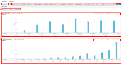
- See and select your saved view
- Use these filters to change what data you see in the chart below
- Save your selected filters so you don’t need to recreate them
- Toggle between business types
- New Pipeline Created
- Use this chart to see your team’s newly created pipeline over a specified time frame.
- Total Pipeline Closing by
- Use this chart to see your team’s pipeline that is closing by a specified time frame.
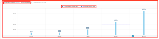
- Total Pipeline Created by “specific day” of previous quarters
- Use this chart to check pipeline that was created by a specific day in the previous quarters against pipeline creation targets (target example is dotted line in Q1 2021).
Note:
- To change the time frame use the drop-down on the top right corner labeled “Created In” on chart 5 or “Time Period” in chart 6. Use the “Time Interval” dropdown to display the chart in a different interval.
-
To remove target lines, click the Pipeline Creation Target check box in the top center of the chart. If you would like to see just targets for pipeline creation you can also uncheck the Total Pipeline Create Value checkbox.
Video Walkthrough:

Pipeline Risk Analytics
Summary:
Pipeline Risk Analytics allows users to analyze which deals are at Risk based on the various stages. Use the charts to dive deeper into various data points on your at risk deals.
How To:
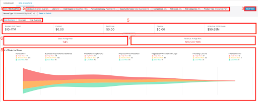
- See and select your saved view
- Use these filters to change what data you see in the chart below
- Save your selected filters so you don’t need to recreate them
- Toggle between business types
- Metrics Bar - Quickly redraw your list of opportunities down to a specific forecast category level by clicking on one of the numbers in the bar
- Displays the number of all deals that are at High Risk based on your filters
- Displays the total amount of all deals that are at High Risk based on your filters
- Use this chart to view your High Risk, Medium Risk, and Low Risk deals based on the deal stages. Users can click through each Risk level based on the color to see the deals that correspond with that category.
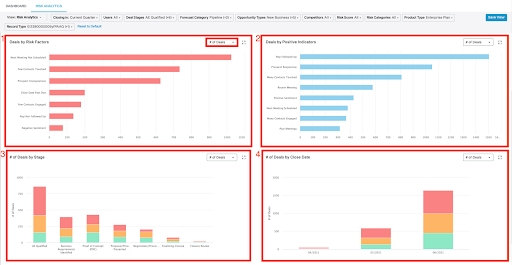
- Use this chart to analyze the total number of deals and the revenue impacted by each Risk Factor.
- Use this chart to analyze the total number of deals and the revenue impacted by Positive Indicators.
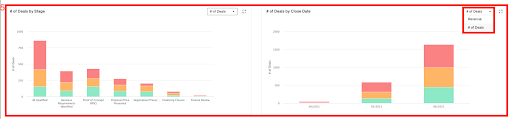
- Use this chart to see the total number of deals and revenue amount grouped by Stage.
- Use this chart to see the total number of deals and revenue amount grouped by Close Date.
- Use this chart to see the total number of deals and revenue amount grouped by your Stage and Close Date.
Note: Use the dropdown on the top-right corner to view the chart by # of Deals or Revenue
Video Walkthrough:

Comments
0 comments
Please sign in to leave a comment.